¶ Minmatar FL33T Alliance Overview Setup Guide
Guide originally written by Alesis Wicked
Eve online’s UI provides a copious amount of information and while playing this can often lead to information overload. To combat this, something we do is utilise the overview to provide information in an orderly fashion, and we further augment this by setting up a set of tabs to filter out all none essential information for a given task; be it hauling, selecting targets in pvp or searching for structures in a given system to name a few.
The information here will guide you through setting up these filters for your overview, your dscan window and the brackets you see in space.
¶ Basic Terminology:
Tab: This is the filtered and listed information on the overview, there are multiple tabs on the overview, selected by clicking their name- much like the folder tabs in a filing cabinet drawer.
Overview: The UI Element where information is listed, filtered and organised
Brackets: This is used to describe any icon you see in space and not in separate windows; So warpables, celestials, ships, wrecks etc symbols that are visible within the skybox- your ship and all animations appear within the skybox and all UI elements such as colour tags used to aid in seeing things in space when zoomed out from them are the brackets. Brackets can be filtered but the items themselves will stay- useful when there is a lot happening on grid.
¶ How to Set-Up an Overview From Scratch, or Modify an Existing One
-
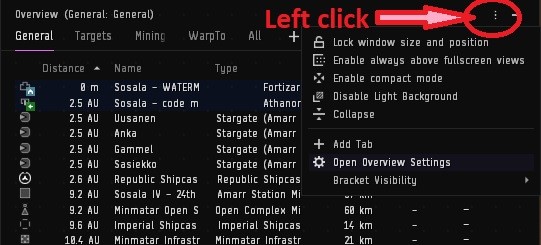
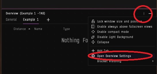
Open overview settings.
-
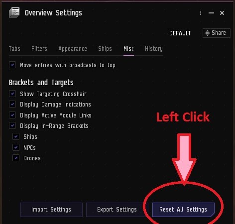
Reset overview to default (only needed for replacing a previously modified one)
-
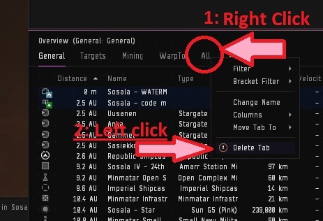
Delete all the tabs except one (only needed if building from scratch)
-
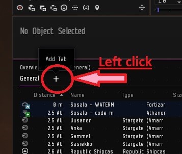
Click the add tab plus sign on the top of the overview.
-
In the pop-up prompt, add a name (This will be the name of the overview tab header) and select a default setting close to what you want it to show, leave brackets on default.
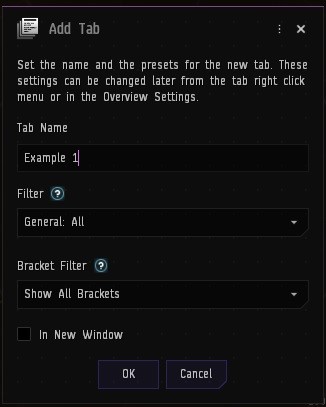
-
Select the new tab, and then open overview settings by clicking the “3-dot” icon in the top right of the overview.
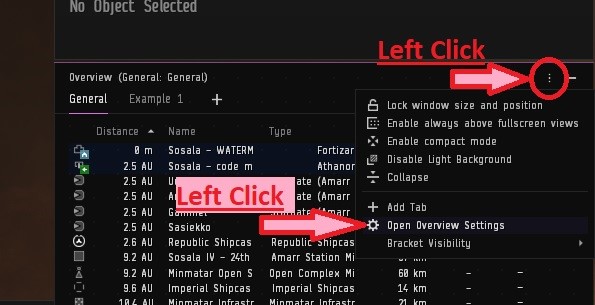
-
Navigate to the filters tab and customise the filters by selecting/ deselecting the types of in space ships/ celestials etc that you’d like to see in the tab.
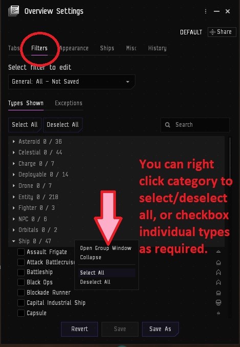
-
Next navigate to the Exceptions tab.
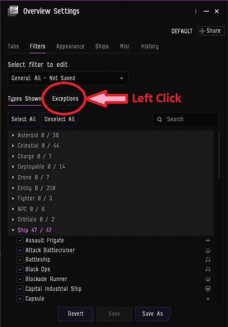
-
Filter out and add exceptions as required, for instance, only wanting to see the ships of players who are not in your fleet and ignore the low sec status pilots who are friendly.
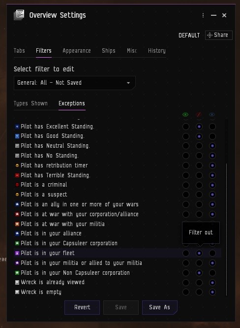
-
Click the “save as” at the bottom of the settings window.
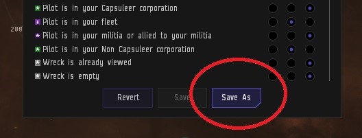
-
When naming add “tab” at the end.
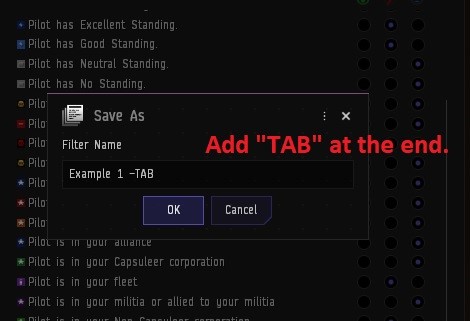
You have now created an overview tab! Move on to the brackets if you wish to customise what appears in space.
¶ For the Tab’s Brackets
• In order to customise brackets for the tab you just created, you need to make a new tab via the instructions above.
- Note: It will appear as if you are duplicating the previous tab. This is fine.
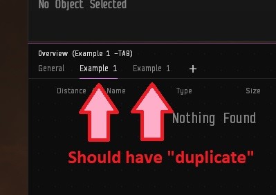
• Repeat above steps 4 to 10 for creating a tab, however, remember to make selections and filters based on what you’d like to see in space.
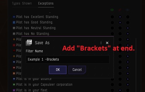
On step 11 however, add “brackets” to the saved name instead of “tab”
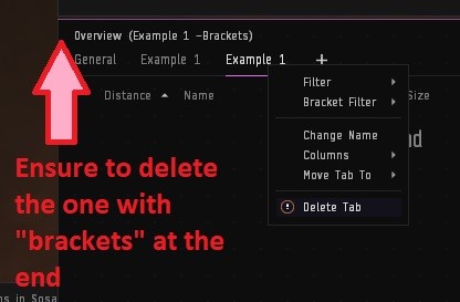
• Delete the brackets tab once you have saved it by right clicking the tab name on the overview.
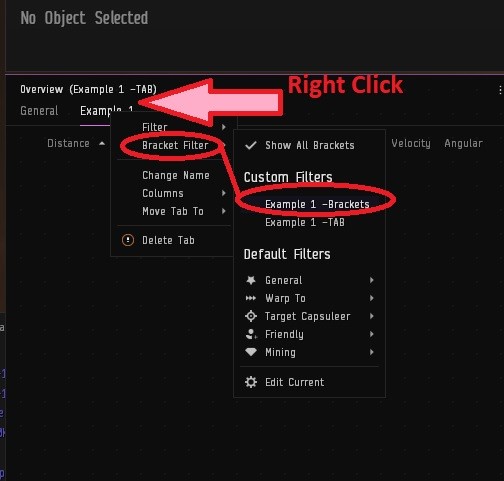
• Right click the remaining tab that you created and load in the “brackets” by navigating to it in the right click menu:
¶ Further Customisation:
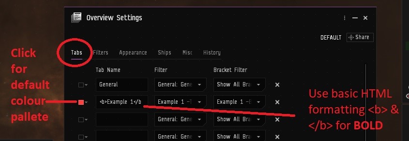
• In overview settings first tab (top left) you can set name and colour format
• Using basic code of <b> name </b> in the name box you can format the tab header (name) into bold. (Google other formatting codes for html for italics or other colours etc as needed)
¶ Other Tabs:
I recommend having a “utility” tab (named utility, and default settings applied for ease of creation). With this you can load in any number of presets on the fly- This is often used when in combat, when needing to prioritise looking for a certain ship class- (such as dictors or booshers,) The premade ship class selections installed by default are usually ok; but if the fancy takes you, you could build a whole collection of various tab presets to your hearts content in preparation for the rare time you find yourself needing to load a particular selection of ship types.
There is no limit to the number of tabs you can have prepared, but there is a limit to the number of tabs you can have active at any one time; so having this Utility tab allows you to quickly swap between whatever filter is needed on the fly, without going through the work of creating a tab in the middle of a fight.
¶ DSCAN Filters:
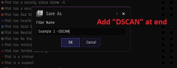
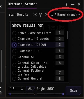
For dscan, the process is much the same, name the tab on save as “dscan” instead of tab or brackets,
and then it the dscan window at the top right, simply find your custom filter in the list and select it.
¶ Customising Settings:
• To change priority order, drag and drop. I recommend having “Pilot is in your fleet" at top of the list.
• Make sure to set the exceptions so that pirates in fleet are filtered out of bad guys overview
¶ Misc:
Right click on flashing colours to enable/disable blink.
Hover over the coloured icon to customise what colours you would like to have that category display as- be aware many people stick with default colours, and a lot of terminology will refer to “flashies” or NPSI (Not purple shoot it) or “they’re blue” (Friendly) etc, so I don’t recommend changing colours unless you are already familiar with the defaults and can translate the terminology on the fly to match your new selection.
¶ Colourtab / Background
The colour tag tab will affect the icon you see in the local chat box and beside the ship icon on the overview. The background tab will affect the colour of the background of the item on the overview.
Knowing this, it is possible to set them to display different information, For example: Having a militia member who is known for awoxxing (killing friendlies) be set red (minus ten as a contact set by alliance, also known as standings), so you spot them as red in local and can prepare accordingly, but on your overview, you will still see they are a member of your militia, and using exceptions in the overview settings will show them on your enemies tab, but you’ll be aware that engaging with them will affect your standings or take gate guns if you are the first to aggress- This prevents being caught by surprise and losing a ship because they didn’t properly display on your overview.
¶ Multiple Overviews:
You can right click a tab and move to new window if you would like to separate a particular tab from the overview and display two sets of information at once (often used for friendlies tabs or looting tabs, so you can monitor who is still on grid with you etc, without needing to tab away from crucial information on the main overview.)
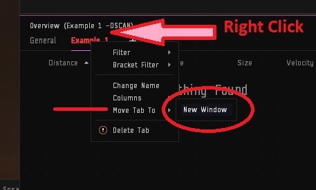
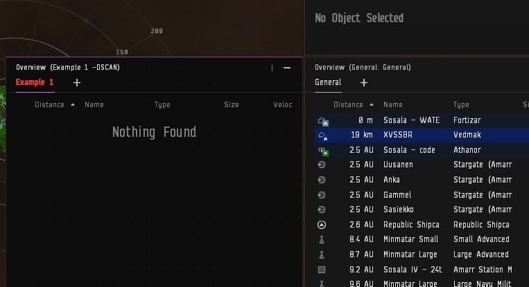
Be sure to select which overview box you would like to remain as the default for showing brackets in space, which will ignore any brackets tab on the other window.

¶ Gate gun/ standing loss proof suggestion (advanced player recommended)
• Change colour of standings via contacts options so terrible and bad are same colour (e.g RED)
• In overview settings sort priority so bad and terrible show above -5/suspect etc
• Set -5, suspect, criminal etc to same colour (e.g Orange)
• Neutrals show at bottom of list
• “Has killright available” above neutrals.
Now all targets with bad standings who you will take gate guns for will show as one colour (red), all targets who you do not take gate guns ot standing loss for (regardless of why) will show as a separate colour (orange).
¶ Overview information display:
• Right click the bar, select change order.
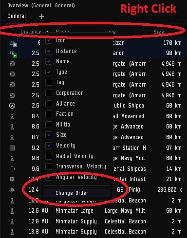
• Place in order you want and select which you want.
• Manually set size of each type, might need to expand the box to see all selected options.
• Repeat process for each overview tab.
¶ Overview Standings Settings
- Standings visibility may need to be adjusted in the in-game overview to ensure that targets can be seen on the overview. Notably, pilots who have been set as negative standings by the Alliance but are still in the Minmatar Militia may not show up on some PVP Overviews; this can cause a problem when in combat with such pilots.
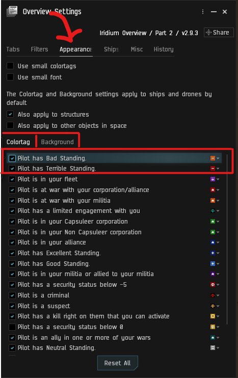
- To fix this, we want to ensure that the standings of the pilot takes priority over the militia status of the pilot. This is done by dragging Bad and Terrible standings to the top of the list in the Overview Settings window.
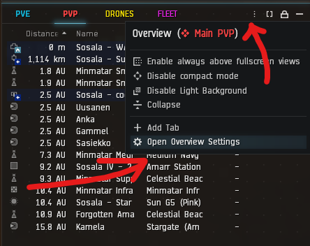
- Open the Overview Settings by clicking the three-dot hamburger menu at the top of the overview window you wish to edit. Under the appearance tab, there are two options; Colortag and Background. Colortag refers to the small tag next to the shiptype icon, and Background refers to the background color of the pilot in the overview. For both of these, drag the "Pilot has Bad Standing" and "Pilot has Terrible Standing" to be somewhere above "Pilot is in your militia". I reccomend to show the colortag above being in fleet, while the Background to be below.
- Additionally, in the Filter Window, ensure that "Bad Standing" and "Terrible Standing" are set to Always Show.
- Corp and Alliance standings are always set for a reason. If a group in the militia has been set by the alliance at -5 or -10, there's a high chance they're probably hostile.
- Because of this, it's important to be able to see them on PvP Overviews.
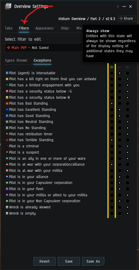
- Because of this, it's important to be able to see them on PvP Overviews.
¶ Future proofing:
Be it by bugged update, client re-install, a new computer or any number of unpredictable ways; occasionally you will log in and find all your overview settings have been reset to the default settings and this can be heartbreaking due to the time it takes to set them up. In order to future proof your settings so they can be quickly accessed and reinstalled, there are several things we can do.
• Notepad:
Open an in-game notepad note and then open your overview settings, in the top right of the settings is a share icon. You can drag this into a notepad note and it will leave a link to all of your overview settings, which is not stored locally. Simply clicking this link will load up all your settings for the overview, bracket and dscan filters.
• Evemail:
Similarly, you can mail yourself the same links- personally I prefer the notepad option as mails can get lost in the list of received mails, but it works much the same as notepad, simply clicking the link in the email will restore your settings.
• Chat MOTD:
If you have a chat channel for you and your alts, you can add this same link to your motd along with any other relevant settings, such as fleet/ broadcast settings and bookmark folders for quick access.
• Export:
Within the overview settings at the bottom of one of the tabs, (where you also find the save tab settings button), is an export button. Using this will export a file to a folder on your pc that contains all your overview, brackets in space and dscan settings. Note if doing this, you will not have access to them if you are switching to a new pc, so its always a good idea to also use one of the above methods as well as using export, for redundancy.